Building an Agricultural Monitoring Dashboard
For busy humans
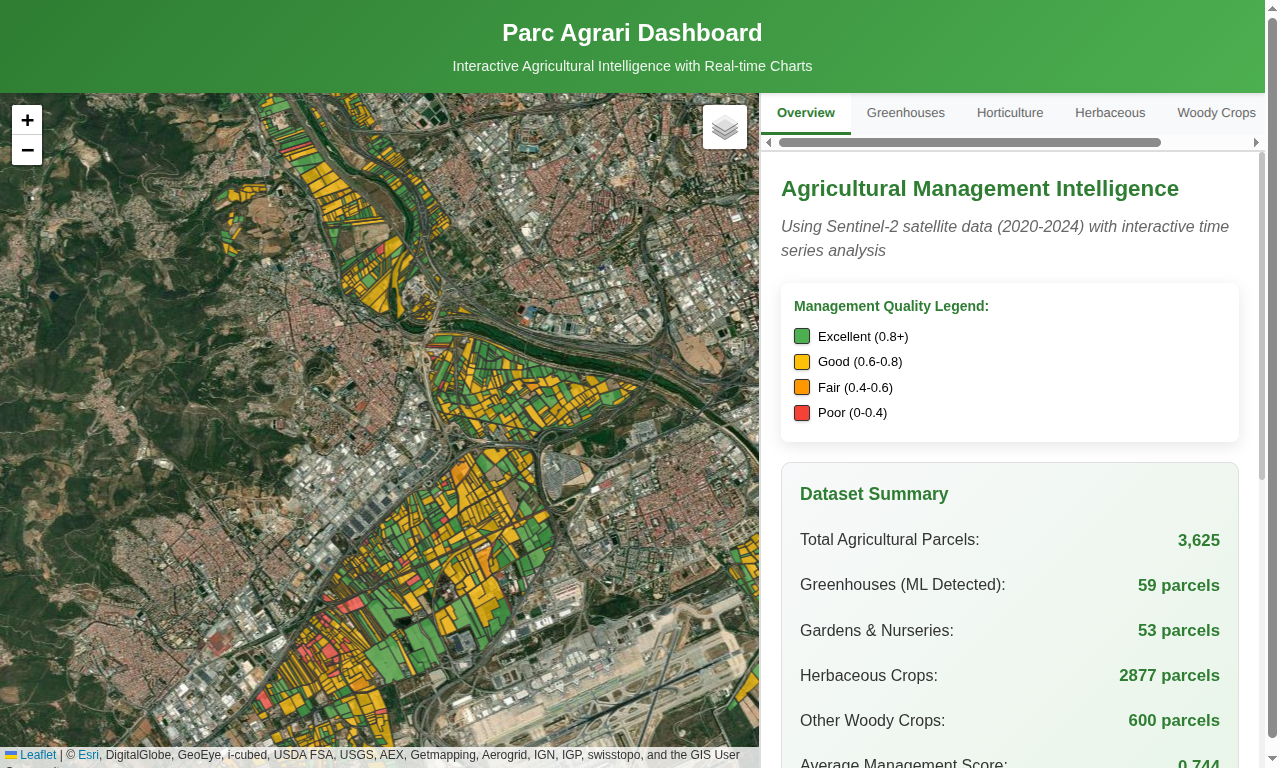
This dashboard turns Sentinel-2 satellite time series into an interactive map for monitoring 3,625 agricultural parcels near Barcelona. It combines parcel-level vegetation indices, management quality scores, greenhouse detection, and on-demand charts in a static Leaflet and Chart.js web app.
The Parc Agrari del Baix Llobregat covers 2,938 hectares of agricultural land near Barcelona, supplying fresh vegetables to 3.3 million people in the metropolitan area. The area contains 3,625 individual parcels across 14 municipalities.
The challenge: create a visual assistant to monitor the state of agricultural production across thousands of parcels.
This system was developed as part of UNIGIS master's research using Sentinel-2 satellite data (2020-2024) combined with machine learning and web visualization to assess management quality and detect infrastructure like greenhouses.
Technical Approach
The dashboard uses straightforward web technologies:
- Leaflet.js for the map interface
- Chart.js for time series visualization
- No external APIs - everything runs locally
- Free base maps from OpenStreetMap, CARTO, and Esri
The system generates a single HTML file with all functionality included. No server setup, no database dependencies.
Data Architecture
The system generates separate JSON files for efficient data delivery:
data/
├── parcels.geojson # Map polygons and basic properties
├── parcels_summary.json # Agricultural metrics for all parcels
├── categories.json # Analysis by agricultural type
└── timeseries/
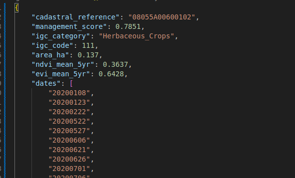
├── 08169A01200042.json # Individual parcel time series
├── 08169A01200043.json
└── ... (3,625 files total)Each parcel gets its own JSON file with complete time series data. This keeps the initial page load fast while providing detailed data on demand.
Dashboard Features
Interactive Map
The map displays 3,625 agricultural parcels color-coded by management quality:
- Green: Excellent management (score > 0.8)
- Yellow: Good management (0.6-0.8)
- Orange: Fair management (0.4-0.6)
- Red: Poor management (<0.4)
Users can switch between multiple base layers including satellite imagery for visual verification of agricultural patterns.
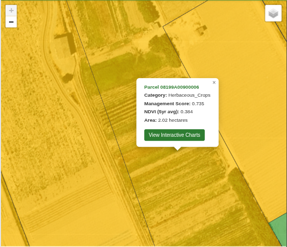
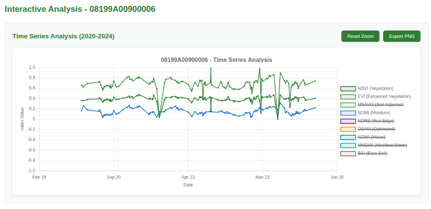
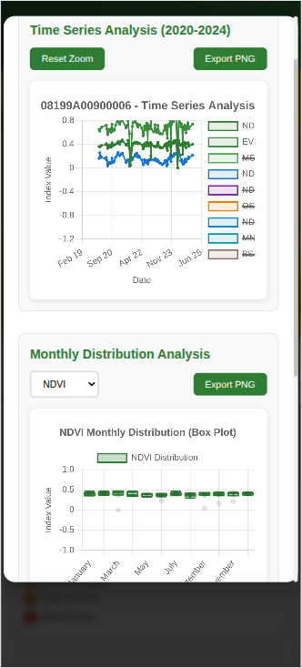
Time Series Analysis
Clicking any parcel loads its complete agricultural history from 2020-2024. The system displays 9 agricultural indices across 122 acquisition dates, allowing detailed temporal analysis of:
- NDVI, EVI, MSAVI2 - vegetation health and density
- NDMI, NDWI, MNDWI - water content and irrigation patterns
- NDRE, OSAVI, BSI - advanced vegetation and soil metrics
Charts include zoom and pan functionality for examining specific time periods in detail.
Agricultural Intelligence
The dashboard organizes analysis by agricultural categories:
- Horticulture - intensive greenhouse and garden operations
- Herbaceous crops - seasonal field agriculture
- Woody crops - fruit trees and permanent cultivation
- Greenhouses - ML-detected covered agriculture
Each category displays top and bottom performers with direct navigation to specific parcels for detailed examination.
Implementation Details
Time Series Loading
When users click parcels, the system loads individual JSON files containing complete temporal data. This approach provides:
- Fast initial loading - only map data loads initially
- Detailed analysis - complete time series available on demand
- Memory efficiency - data loaded only when examined
- Scalable architecture - works with thousands of parcels
Mobile Compatibility
The interface works on tablets and mobile devices. Touch-optimized controls enable field use for agricultural assessment and validation.
Agricultural Insights
The visualization reveals several agricultural patterns:
Greenhouse detection: Machine learning correctly identifies covered agriculture as low vegetation score areas. Visual verification with satellite imagery confirms greenhouse structures.
Crop cycle analysis: NDVI time series clearly show planting, growing, and harvest cycles. Different agricultural types display distinct temporal patterns.
Management quality assessment: High-scoring parcels consistently demonstrate regular crop cycles and optimal timing of agricultural activities.
Seasonal optimization: Time series analysis identifies optimal planting and harvest timing across different agricultural categories.
Live Access
The agricultural monitoring dashboard is available at: https://lorenzobecchi.com/unigis/
The interface provides complete access to 2020-2024 agricultural analysis across all 3,625 parcels.
Usage: Click any agricultural parcel to examine its complete temporal history. Switch between base maps to compare satellite analysis with visual imagery. Use chart controls to zoom into specific time periods for detailed examination.